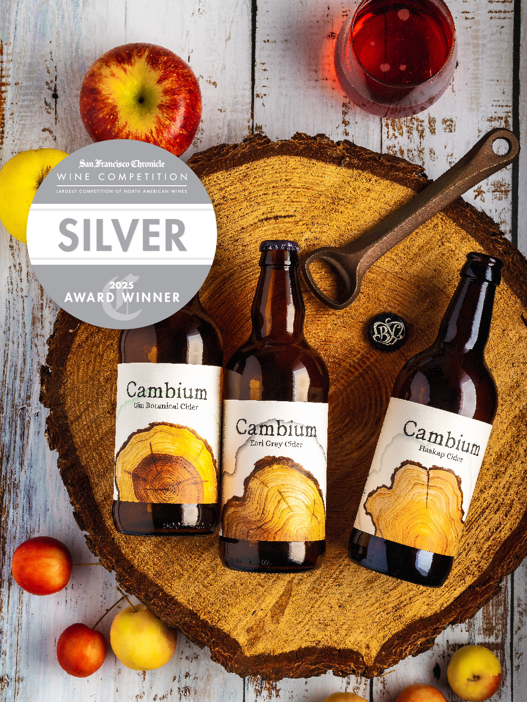
 We’re thrilled to share that our packaging refresh for Cambium Cider has been awarded a silver medal in the 2025 San Francisco Chronicle Wine Competition, a testament to the power of design in storytelling.
When Cambium Cider, a generational family orchard in Vernon, BC, approached us for a rebrand, they wanted packaging that reflected their heritage and connection to the land. Our design journey started with a focus on their story: the orchard’s three generations of growth and the natural beauty of apple tree rings, which symbolize time, growth, and sustainability.
Here’s how we brought this vision to life:
1ï¸âƒ£ Custom Watercolor Art: Each label features hand-painted tree rings created by our lead designer, Marina. Watercolor was chosen for its transparent, layered quality, which mirrors the natural layers found in trees. These rings celebrate the cambium layer, a vital part of a tree’s growth and a fitting metaphor for Cambium’s legacy.
2ï¸âƒ£ Tactile Connection: The organic texture and design evoke the orchard’s authenticity, creating an emotional connection for consumers who value craft and heritage.
3ï¸âƒ£ Collaboration: We worked closely with the Cambium team to ensure the design didn’t just look beautiful but also authentically represented their story. This collaborative approach is key to ensuring a package resonates both on the shelf and in the heart of the brand’s audience.
This award highlights the importance of thoughtful, story-driven design that goes beyond aesthetics. For wineries and cideries, packaging is a key touchpoint for building trust, creating connection, and standing out in a competitive market.
Let’s raise a glass to Cambium Cider and to designs that make an impact! If you’re considering a rebrand or packaging refresh, we’d love to explore how we can bring your story to life.