You have mere seconds to capture a consumer’s attention to get them to notice your bottle, pick it up, and ultimately purchase. In a sea of wine options—at retailers and online—how do you make your label stand out?
There are steps every buyer takes in selecting a new wine off the shelf:
- Step 1: Something on the label catches their eye
- Step 2: They walk closer
- Step 3: They pick up the bottle
- Step 4: If the label has texture, they feel it
- Step 5: They turn the bottle around to read the romance copy
When someone goes through all those steps, a majority of the time they put it in their basket.
The process is adapted for online purchase, with obvious differences. They can’t pick up and feel the bottle or label, but they can see it, read it, and then explore the tactile factors after purchase.
The label can have a significant impact on purchases. A consumer has to like your label before they’ll be able to try your delicious wine.
Here are our tips for creating a wine label that stands out.
1. USE COLOR TO CATCH EYES
We’re not saying you have to have a rainbow of colors on your label. On the contrary, dark, seductive designs can capture as much attention as bright, flamboyant looks.
The blend of colors on your label and your bottle have to be as well-thought-out as the blend inside the bottle. Everything works together to create a visual experience that serves as the first attention-grabbing step in the buying journey.
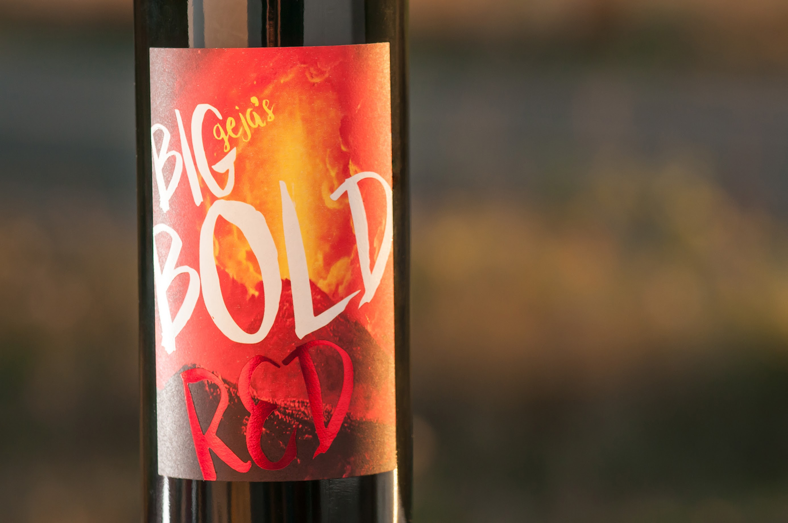
For example, a Big Bold Red requires a big bold label. We worked with Geja to create this eye-popping label with vibrant colors and a red foil overlay.
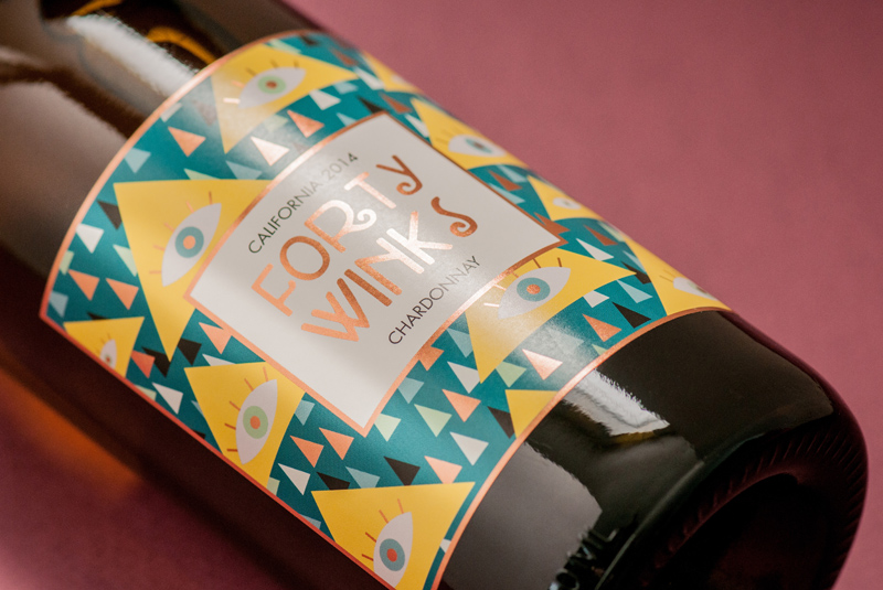
Forty Winks Winery combined patterns, colors, and a shimmery finish to grab attention from across the room.
In keeping with school spirit, this Notre Dame wine from Trinitas Cellars puts the blue and gold on bold display, with a hot stamped finish and embossing for added texture.
Again, using color doesn’t mean you have to go bright or go home. Dark, unstated colors can have just as big of an impact, when done right.
Wilson Creek put a dark label on a dark bottle for a stunning, stately look. By using mostly shades of gray, the gold stamping and red shield stand out, making a Wilson Creek blend instantly recognizable.