.jpg)
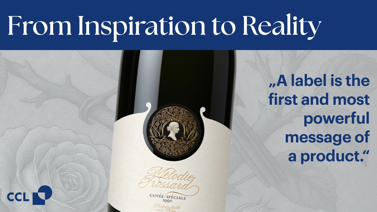
Great Champagne tells its story long before the cork is popped. With the Mélodie Frossard label, an abstract idea rooted in anticipation, rhythm and movement was transformed into a tangible expression of craftsmanship. The result is a Champagne label that translates inspiration into material, structure and embellishment through close collaboration between design and production.
At the heart of the concept lies the idea of Champagne as a silent melody. Not heard, but seen. Not tasted, but anticipated. The perlage becomes a vertical score, each bubble a note rising patiently to the surface. This poetic starting point shaped every design decision that followed.
Translating Inspiration into Design
The creative concept was developed by Atelier Design, an Italy-based studio specialising in label design for high-end beverages. For founder Luca Morandini, the label is more than decoration.
“A label is the first and most powerful message of a product. It must already communicate passion, dedication and the pursuit of quality before the bottle is opened,” explains Luca Morandini.
With Mélodie Frossard, Atelier Design transformed the idea of Champagne’s musicality into a visual language. The imaginary figure of Mélodie – perhaps an opera singer, perhaps a memory carried through time – became the symbolic embodiment of the cuvée. Her presence is not illustrative, but sculptural, giving the label depth and personality while remaining refined and restrained.
When Design Meets Reality
Turning this concept into reality required more than creative vision. From the earliest stages, Atelier Design worked closely with CCL Label’s project team in Trittenheim to ensure that Mélodie Frossard could be brought to life in the best way possible.
“From the beginning, the challenge was to interpret the design intent through carefully chosen materials and production techniques,” says Christiane Spang, Project Manager at CCL Label Trittenheim. “Our role was to shape this creative ambition into a refined, tactile result with the required level of precision.”
This collaboration influenced the structure of the label, its two-part form and the deliberate spacing between elements. It also guided the selection of materials and embellishment techniques, ensuring that each detail contributed to the overall expression rather than competing for attention.
Shaping the Label Through Materials and Processes
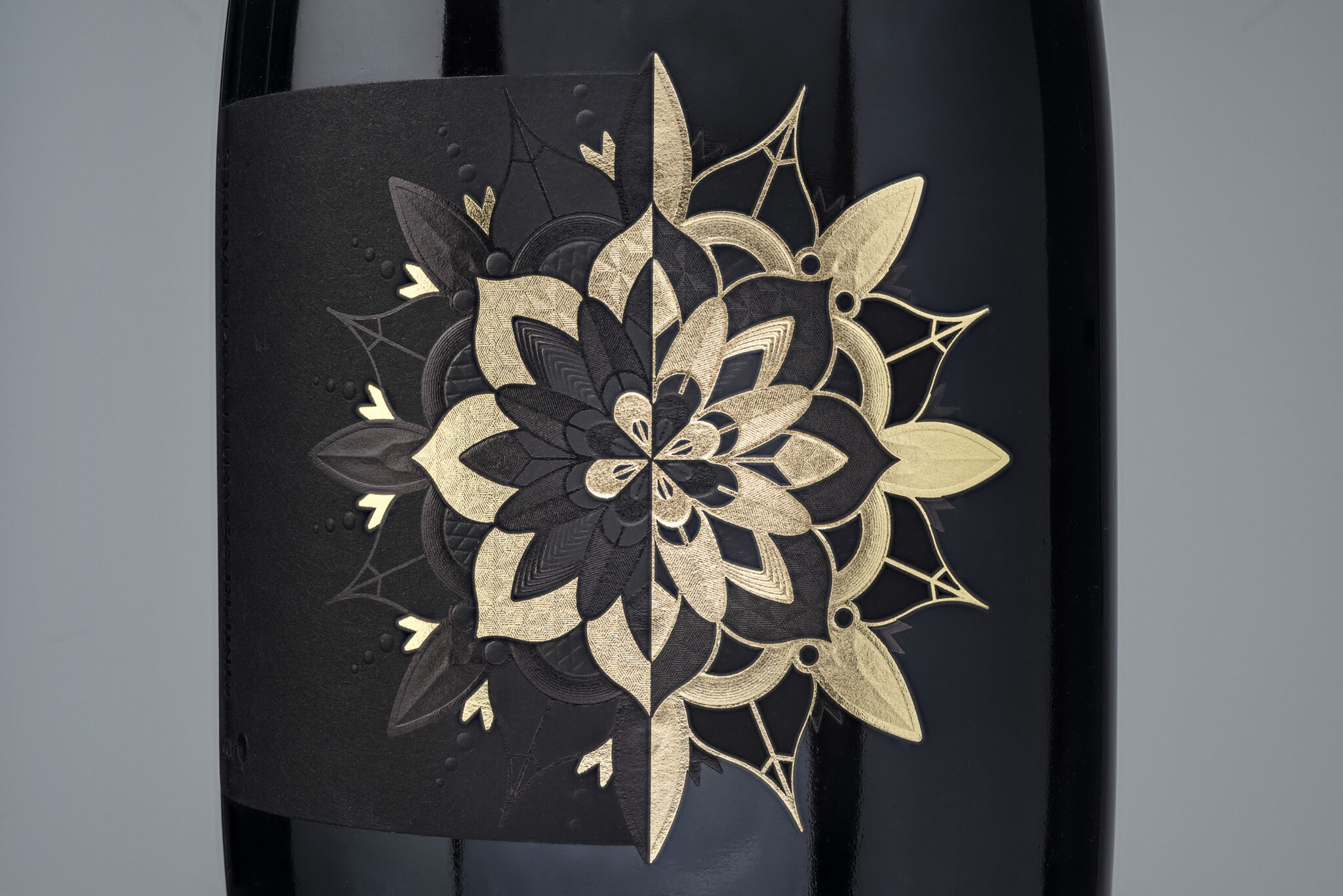
The front and neck labels were designed to work together as a cohesive composition. Carefully selected papers, foils and tooling allowed the design to gain physical presence. Blind embossing, debossing and hot foil stamping were combined in multiple stages to create subtle relief and elegant shine.
The sculptural head, with its three-dimensional blind embossing reminiscent of a marble bust, required precise alignment between artwork, tooling and press settings. This level of detail was only possible through continuous exchange between designer and production team, refining each step until form and finish were perfectly balanced.
The focus on detail and execution reflects a guiding principle and core belief of Atelier Designat the heart of the project: “Make what is useful also (and always) beautiful.” In this label, material choice, structure and embellishment are not added decoration, but integral elements that give the design its final clarity and presence.
A Shared Understanding of Craftsmanship
What defines the Mélodie Frossard label is not a single technique, but the way inspiration, design and production come together. The close cooperation between Atelier Design and CCL Label demonstrates how ideas can be translated into tangible quality when creative and technical expertise are aligned.
The result is a Champagne label that captures anticipation and emotion through structure and detail. A reminder that premium labels are not simply designed. They are crafted.
Follow CCL Label here on LinkedIn to stay in the loop for more about the Signature Collection and premium decoration solutions.
Visit these websites to learn about Atelier Design and CCL Label:
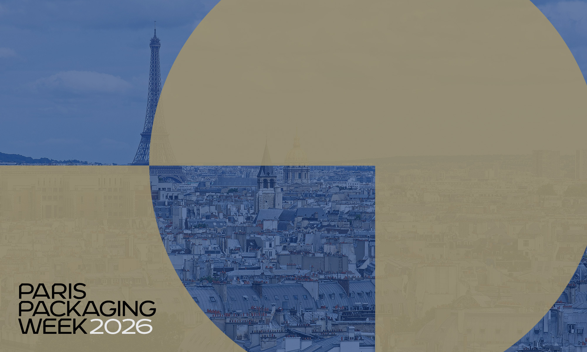
Paris, France – February 2026 — CCL Label, a global leader in premium labelling and packaging solutions, will present its latest innovations for the wine and spirits sector at Paris Packaging Week, held 5th and 6th February 2026 at Paris Expo Porte de Versailles.
At Booth C102, CCL Label will highlight how the future of premium packaging lies at the intersection of high-end design, advanced embellishment, and sustainability – responding to growing brand demand for packaging that delivers visual distinction while meeting environmental expectations.
Redefining Premium Through Sustainable Innovation
CCL Label’s showcase demonstrates how luxury and responsibility can coexist without compromise. The company will unveil a range of solutions designed to elevate brand storytelling and shelf impact while supporting more sustainable outcomes, including:
- Sustainable Shine: High-impact embellishments engineered with sustainability in mind
- Premium labels and sleeves featuring tactile effects, depth and refined shine
- „Haute Couture“ die-cut designs emphasising craftsmanship and precision
- Eco-conscious materials and production approaches for wine and spirits brands
An Exclusive Unveil at Paris Packaging Week
“Among the highlights is the introduction of the CCL Signature Collection, a curated label range for Wines & Spirits that builds on CCL Label’s growing presence in the wine and spirits segment. This new expression showcases refined creativity, exclusivity and technical mastery, designed for premium and ultra-premium brands,” explains Alex Mulvenny, Managing Director Wines & Spirits Europe.
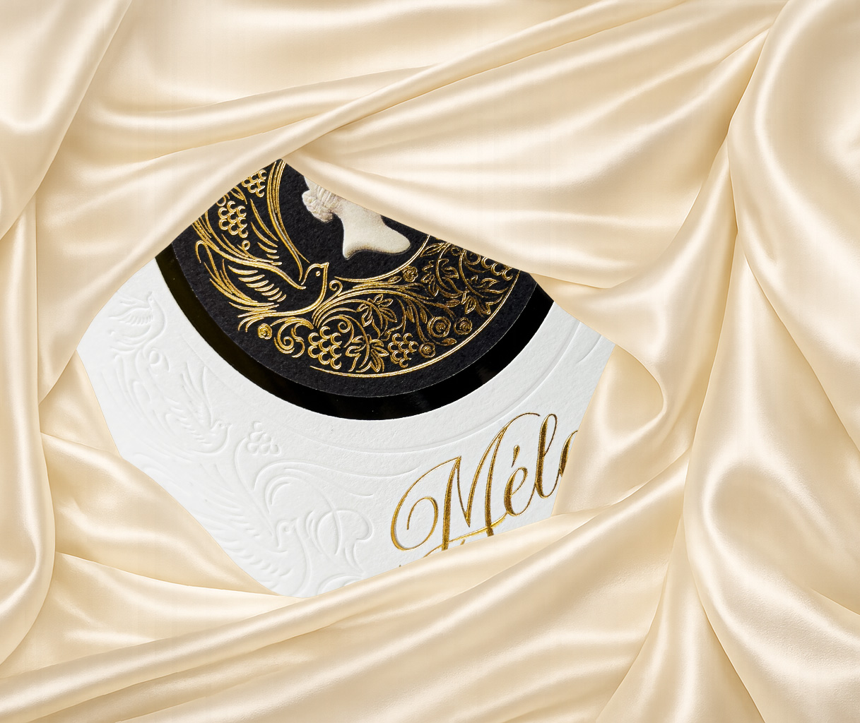 As a special highlight for Paris Packaging Week, CCL Label will exclusively unveil a new Champagne label at the show. Created as a showcase of design excellence and technical sophistication, the label translates craftsmanship, storytelling and premium embellishment into a refined visual expression.
The label was developed in close collaboration with selected partners across design, materials and tooling. The creative concept was crafted by Atelier Design from Udine, Italy, while premium papers were supplied by Fedrigoni. Univacco provided the foils, and specialist tooling expertise was delivered by Hinderer+Mühlich. Together, this collaboration reflects how strong partnerships and technical precision can bring a premium Champagne vision to life.
Combining artistic inspiration with advanced production expertise, it reflects how labels can elevate anticipation even before the bottle is opened. Visitors are invited to discover this new creation firsthand at Booth C102.
A Strategic Platform for Industry Dialogue
CCL Label’s stand reinforces its premium identity and provides a platform for discussions with brand owners, designers, and converters on the evolving expectations shaping the future of wine and spirits packaging.
Paris Packaging Week is recognised as a key international event for packaging innovation, bringing together decision-makers and trendsetters across the luxury, beverage, and sustainability ecosystems.
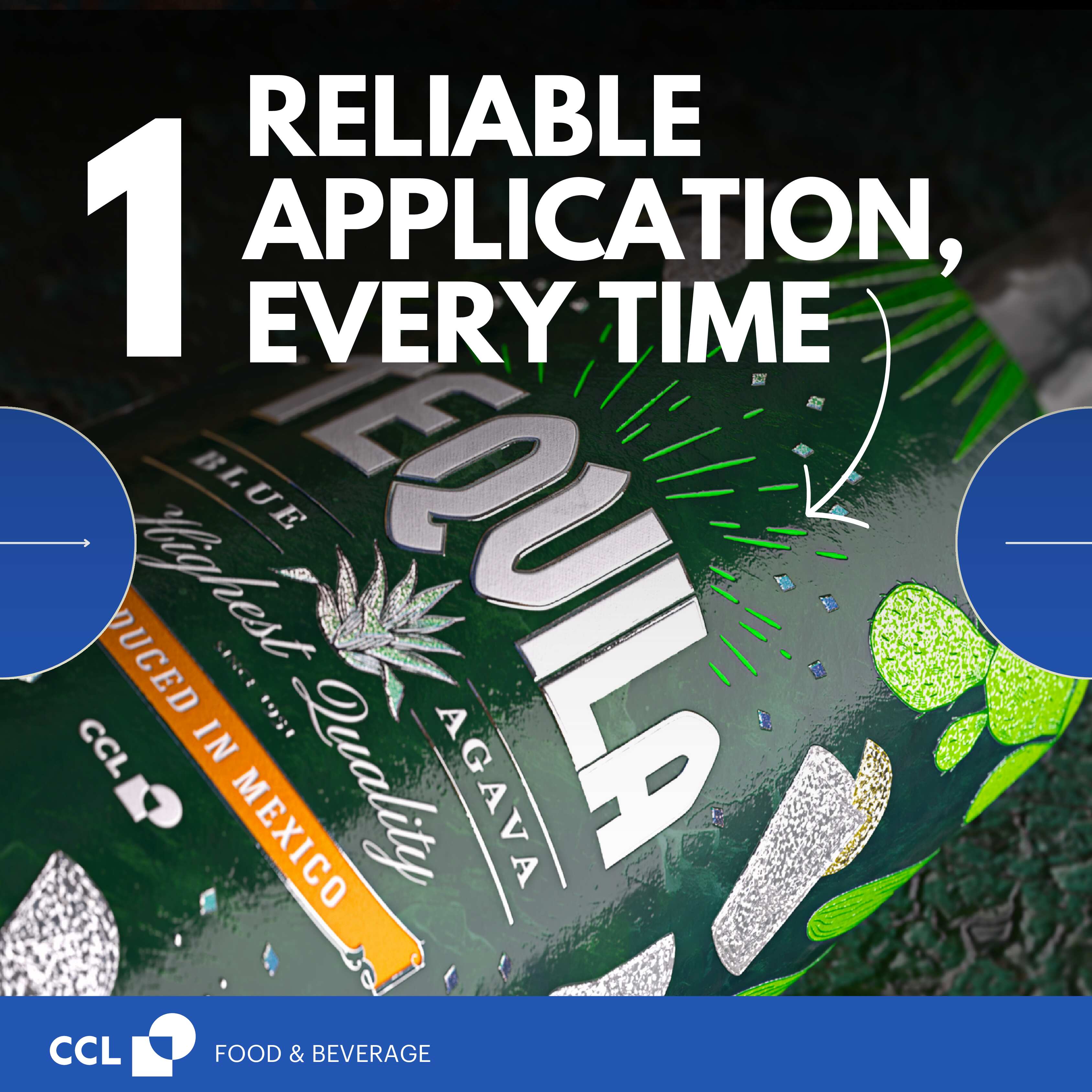
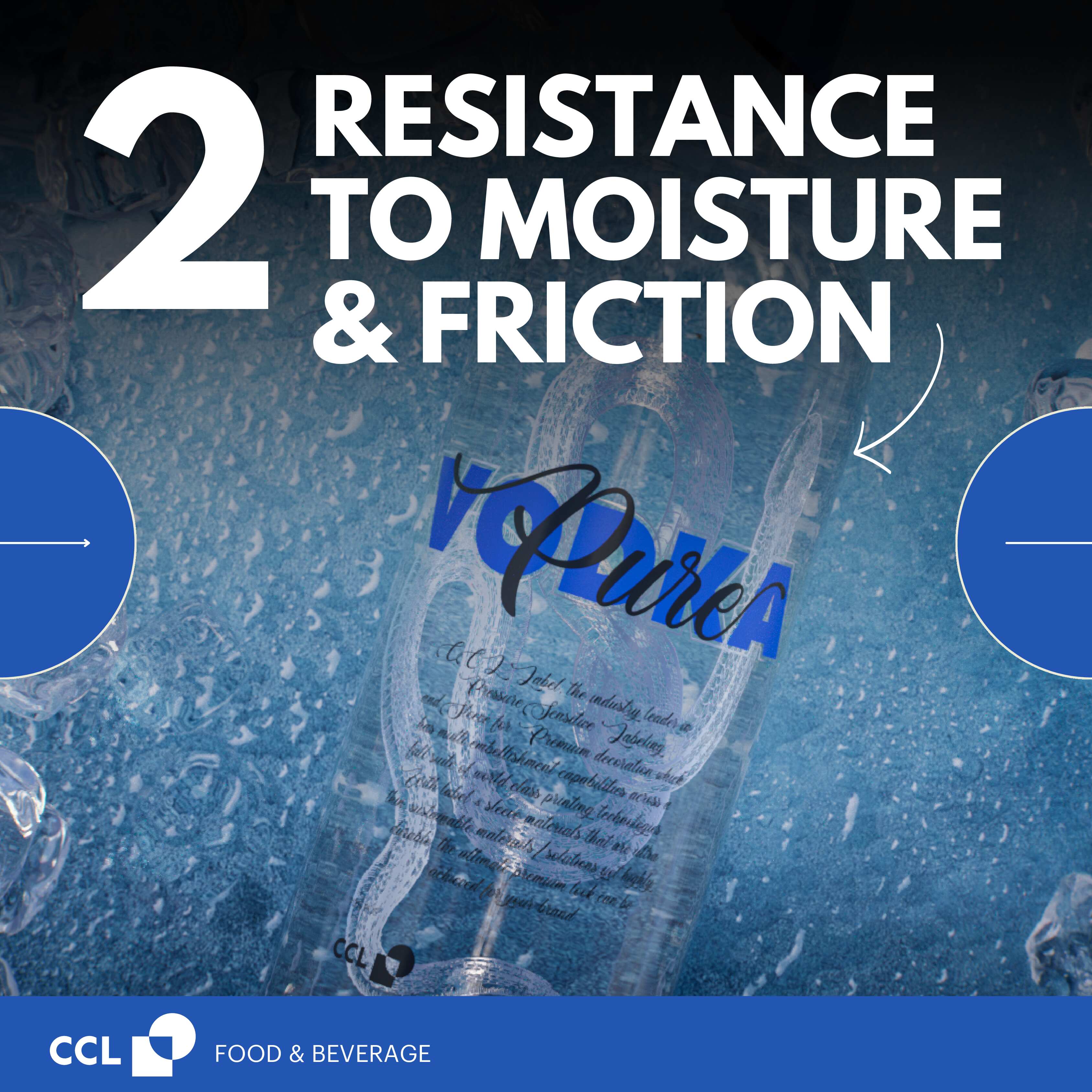
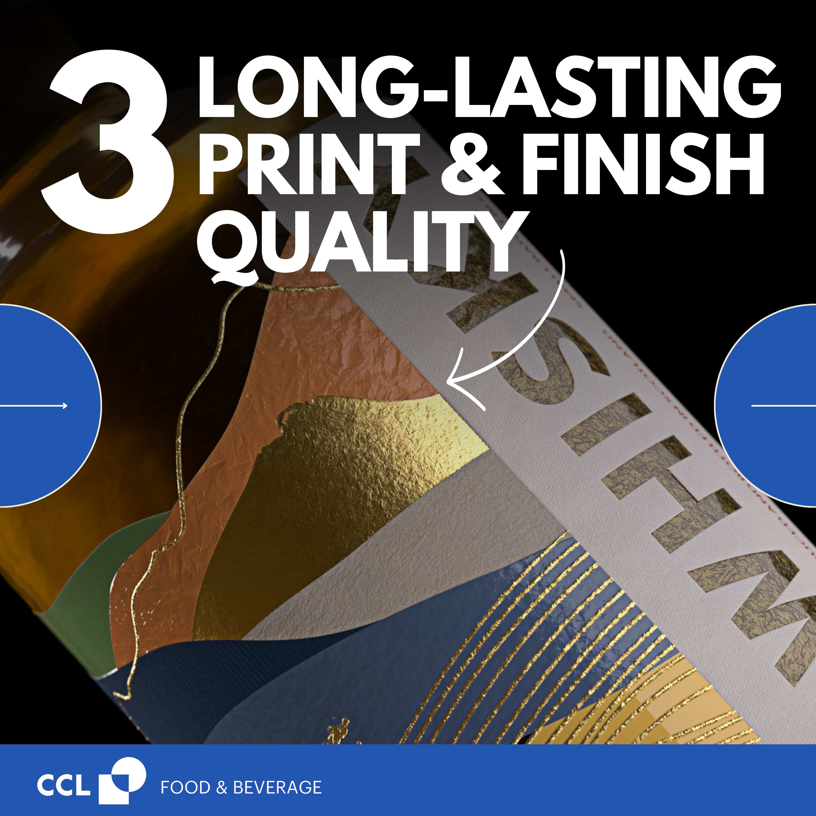
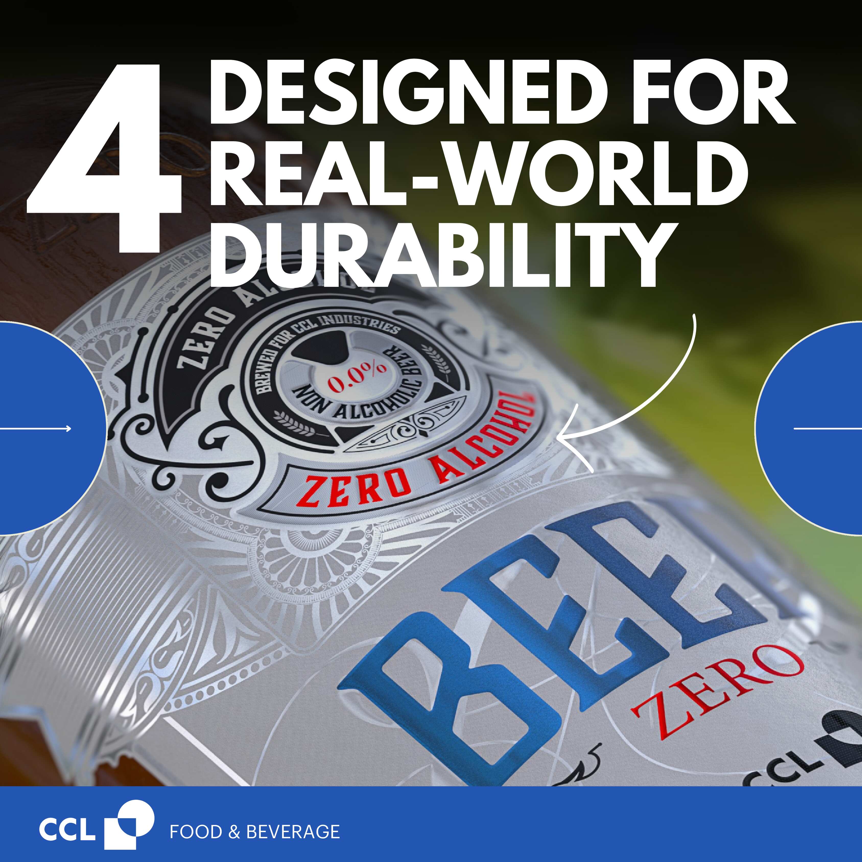
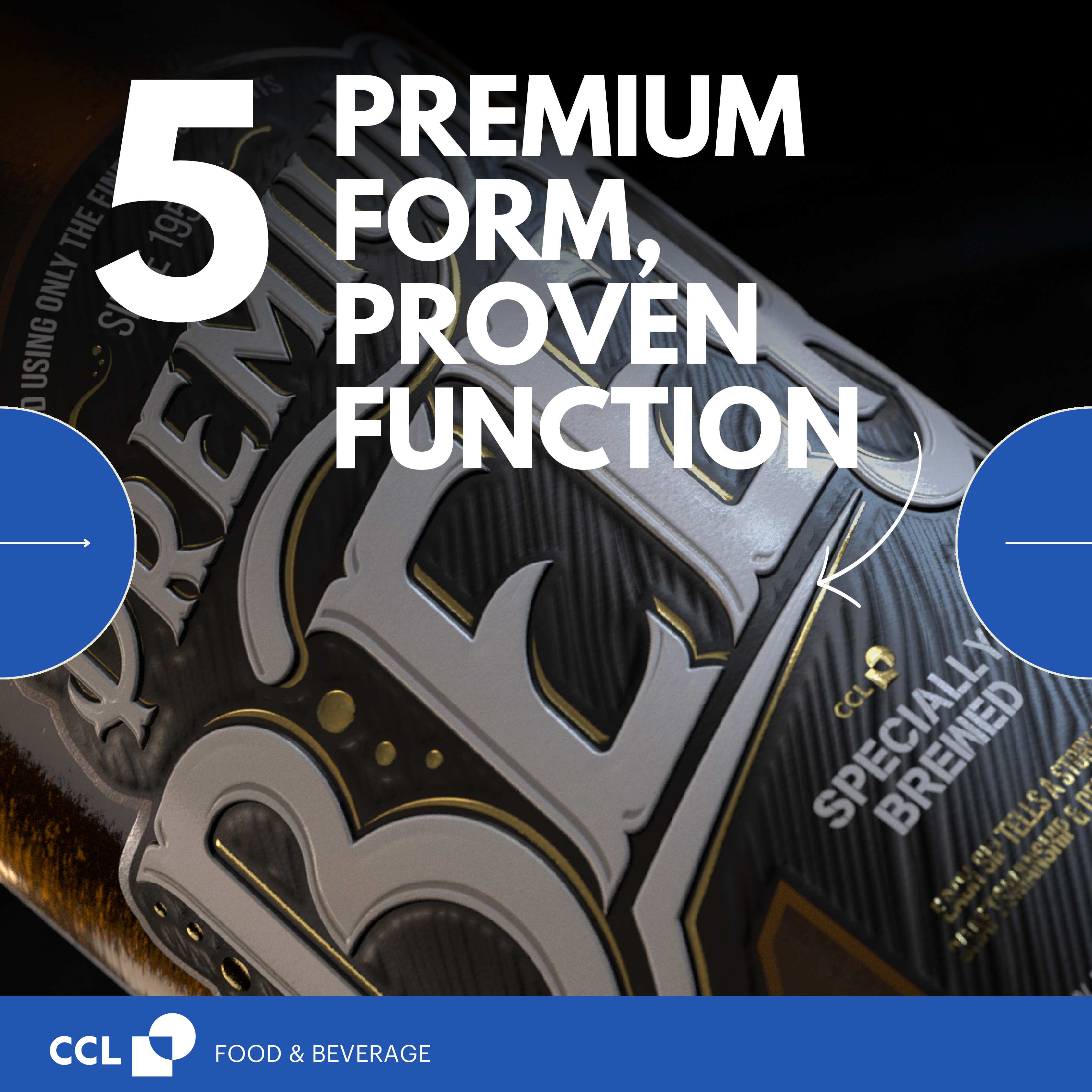
Premium labelling doesn’t just elevate design, it elevates performance. From withstanding challenging conditions to protecting brand integrity through every touchpoint, PSL and Sleeves are engineered for impact.
See below for 5 ways premium labels prove their performance.
With the publication of their new Guide to Design for Good Recycling in Glass, the BDE (Federal Association of German Waste Management, Water and Recycling Industries) and the bvse (Federal Association of Secondary Raw Materials and Waste Management) provide practical recommendations to maximise the recyclability of glass packaging.
The aim is clear: strengthen circularity, improve the quality of glass recyclate and align with European initiatives such as the Green Deal and upcoming sustainability classifications for packaging licensing. While published for the German market, the guidance is highly relevant for glass recycling in general.
Filmic Labels in the Green Zone
A major outcome is that filmic labels are listed in the “green” category alongside paper labels – provided that easily releasable adhesives are used.
This is excellent news for brand owners, as it means filmic PSL solutions can be applied without restrictions if the right adhesive is chosen.
We are prepared to support you with EcoShear, this Pressure Sensitive Label construction is designed specifically for one-way glass containers, combining premium on-shelf performance with optimal recyclability.
Sleeves Remain in the Green Zone
Shrink Sleeves are also confirmed in the green column of the guideline, with the clear recommendation to include perforations. This makes sleeves easy to separate from the bottle before or during recycling – and at the same time opens up valuable design opportunities. With decades of expertise, CCL Label offers a wide range of perforation options, from standard to customised solutions. These can even double as interactive marketing elements, while perforations over the closure provide an additional benefit as a reliable tamper-evident feature.
The positive news: there are no restrictions regarding sleeve size, allowing brands to continue using full-body decoration to maximise shelf appeal while meeting recyclability requirements.
Aluminium Foil Necks Discouraged – Alternatives Available
The guidelines explicitly list aluminium roll-on foils among the materials that disturb the recycling process. They can lead to contamination, colour shifts and production issues in the glass furnace.
CCL offers proven alternatives that visually match foil necks thanks to metallised material, printed metallics and/or hammer blow effects:
- EcoShear Labels for one-way bottles
- WashOff Labels for returnable bottles
What This Means for Brand Owners
The guidelines clearly show that sustainable packaging design and premium brand presentation are not mutually exclusive. With CCL’s innovative label solutions our customers are already equipped to meet and exceed these new recyclability standards.
Together, we make glass packaging future-ready: fully recyclable, legally compliant and visually outstanding.Time to act sustainably. Time to Stand Out.
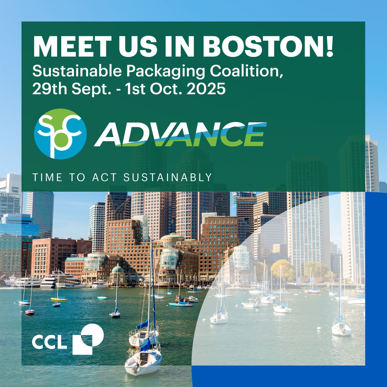
Meet us next week for our next gig at the premier event for sustainable packaging at Sustainable Packaging Coalition (SPC) in Boston!
We will be present with a booth and all the fine label and sleeve innovations we have developed for ecodesign and recycling more FMCG packaging. Discover the sustainable label family and find out why we love labels!
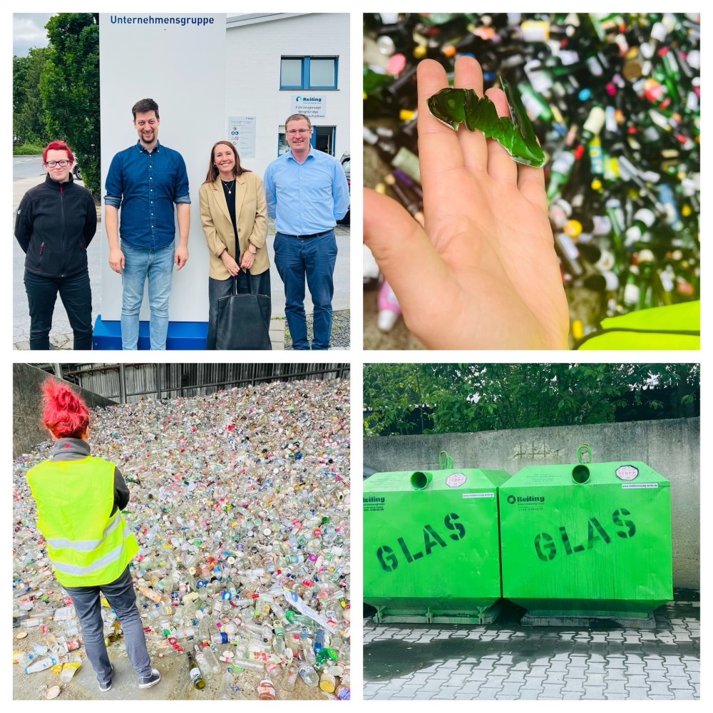
How CCL works with recyclers and sorters to improve our products and make their life easier!
Recyclers and Sorters are an integral part of the CCL sustainability network. We make sure to collaborate with and visit recycling faclities to make sure that our products work in the recycling streams. Field trips and exchanges are high up on our agenda – to one way glass recyclers, polyolefin recyclers and PET recyclers alike. Here is where we get our insights and get our R&D teams involved to make things better!
Recycling glass should be straightforward — it’s infinitely recyclable, after all. But the reality is more complex. One of the challenges in glass recycling is label contamination. Traditional adhesives often bond too tightly to glass shards or leave behind residue that contaminates the cullet stream, causing high rejection rates and unnecessary waste.
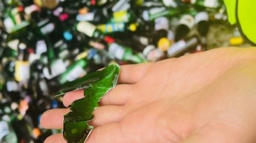 Labels sticking to glass cullets can cause the glass to be ejected
That’s why we’ve developed EcoShear® — a breakthrough adhesive technology engineered specifically for single-use glass bottles. It enables virtually residue-free label removal, dramatically improving the recyclability of glass packaging.
The result? Glass waste during recycling drops to just about 1.5 kg per ton — a significant improvement that directly boosts the yield of high-quality recycled glass.
But we didn’t stop there.
We’re also transforming plastic bottle design for light-sensitive products like yogurt, protein drinks, and probiotics. By using floatable polyolefin sleeves, we’ve enabled a shift from opaque HDPE or PET containers to transparent PET bottles — without sacrificing light protection. The protective barrier is now in the sleeve, not the bottle.
- Carbon-free inks ensure PET recycling remains efficient.
- Bottles maintain their familiar white appearance.
- The entire package meets Design for Recycling guidelines.
Together, EcoShear® and our recyclable sleeves represent a new generation of packaging that supports a circular economy — by design.
At CCL, we’re not just improving recyclability — we’re removing the barriers to it. Because packaging innovation isn’t just about function or branding anymore — it’s about designing smarter systems that work for the planet. Let’s make every bottle recyclable!
 The CCL team (R&D, Sales, Sustainability) out in the wild to improve our label products
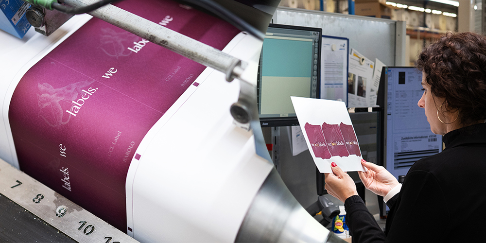
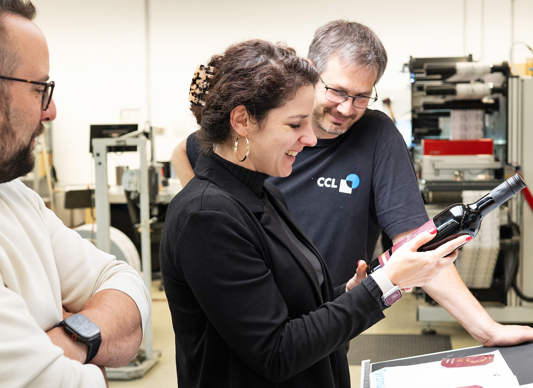 A “generic” label design might sound uninspired at first – but not when it comes from the hands of Caroline Becker, Head of Prepress & Marketing at CCL Label Trittenheim, where the labels were also brought to life. The concept perfectly balances creativity, technical finesse and visual storytelling.
These wine labels bring together romantic symbolism and modern branding through the depiction of an angel with a bow and arrow – a clear nod to Cupid, the classical figure of love and attraction.
In this context, the angel becomes a playful metaphor: just as Cupid’s arrow makes hearts fall in love, this label aims to make consumers fall in love – first with the label and then with the product.
(Read more about the power of labels in article “Choosing Wine is an Emotional Decision“!)
Visually, the angel adds a sense of timeless elegance, while the bow and arrow bring movement and impact, reinforcing the emotional connection between product and consumer.
To bring this design to life, we pulled out all the stops:
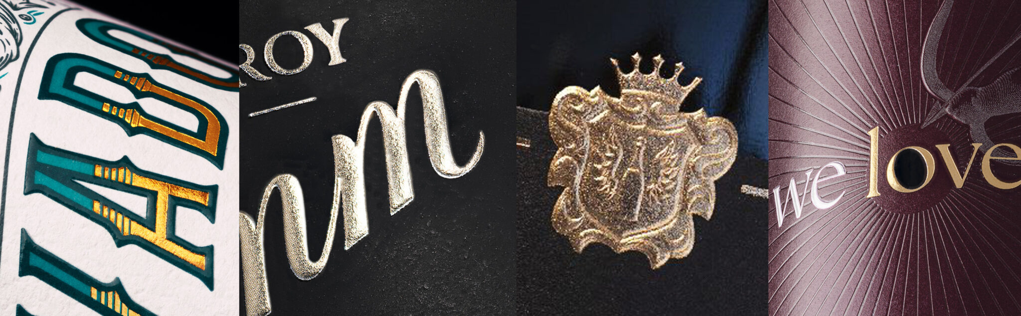
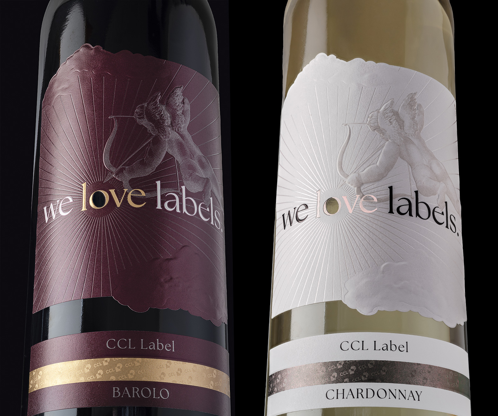 The label is printed on Cotton Touch paper for a luxurious look and feel
- Prismatic foil enhances the words “we” and “labels”, while “love” stands out in metallic silver or gold foil
- Multi-layer embossing brings depth to the clouds and angel figure
- An individual die-cut and a unique cut-out “o” in “love” add an extra layer of sophistication
- Debossing highlights the rays of light, while microembossing adds subtle texture to the bottom label
Special thanks go to our colleague Christiane Spang, who managed the project with precision and commitment. As Project Manager, she ensured that the labels were produced on time and ready for their grand debut at Packaging Première in Milan — despite the usual tight schedule.
This label is more than just a promotional item — it’s a showcase of what’s possible when design excellence meets technical innovation.
Ready to fall in love with wine and spirits labels by CCL Label? Stay tuned for more!
Choosing Wine is an Emotional Decision
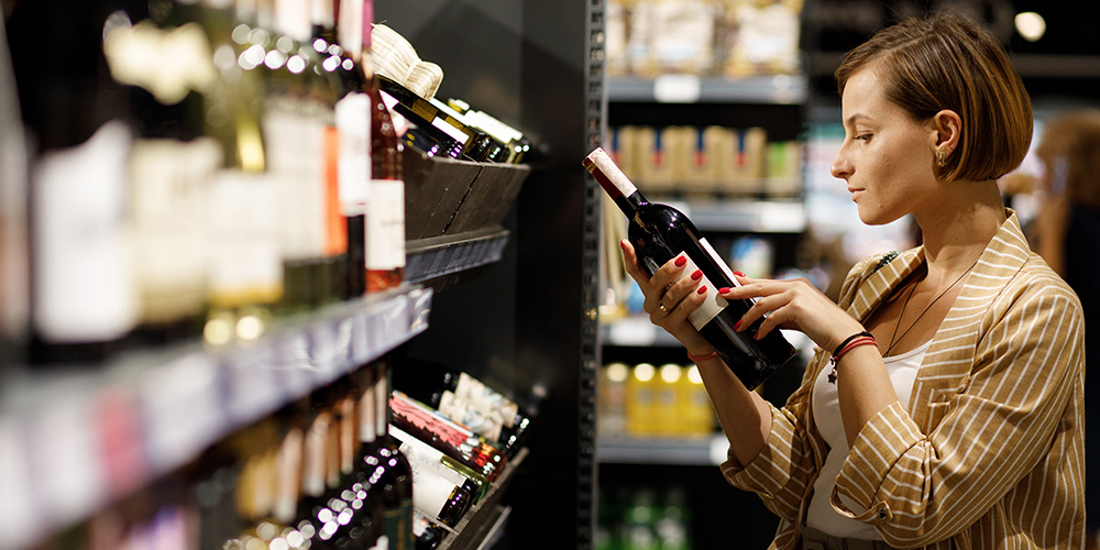
Red, white, or sparkling – when reaching for a bottle on the wine shelf, it’s not just about the grape, origin or vintage. The chosen wine stands out from the crowd and makes an impression visually and to the touch. Labels make all the difference. They highlight the quality of the fine drop, tell stories, and reflect character. On just a few square centimetres, they give a brand a distinctive face in a world of standard bottles. Whether and how this is perceived can significantly influence the product’s success. If the packaging doesn’t appeal, even the best wine inside won’t help.
 First Impressions Count
Let’s be honest. First: the initial impression – the “moment of truth” – is crucial. Second: even well-known brands need to prove themselves on the shelf. Third: the traditional wet-glue label is no longer the benchmark. Pressure Sensitive Labels (PSL) demonstrate that an attractive appearance and cost-effective production are not mutually exclusive – whether for large volumes or limited editions.
CCL Label is a global leader in Pressure Sensitive Labels and enhances them using the latest print technologies and finishing techniques. These innovative alternatives offer boundless design freedom and adhere securely to the bottles. “Unlike traditional wet-glue labels, Pressure Sensitive Labels come with pre-applied adhesive, eliminating the need for glue handling during application – which saves time and money. Cleaner machines require less maintenance,” explains Richard Gilliatt, Technical & Innovation Business Development Director at CCL. “If the functional benefits aren’t convincing enough, perhaps up to 15 per cent more production efficiency will catch your attention. Whether it’s the front, back, or neck label – all are applied in a single pass,” he adds.
15 Seconds of Visibility
Back to the wine shelf. The label has about 15 seconds as a “silent salesperson” to catch the buyer’s attention. Those who strike the right chord with colours, shapes, fonts, graphics and images have a clear advantage. Gloss effects, visible embossing, and textured materials appeal to the sense of touch. Here, appearance triumphs over content – in vino veritas comes later. According to studies, the vast majority of people choose based on visual preferences – and these are anything but rational.
After Sight Comes Touch
Once interest is sparked, the hand reaches for the bottle. Now it’s make-or-break. Haptic qualities come into play. How does the wine feel as a whole, and does the presentation meet expectations? Chardonnay, Barolo, Pinot Noir, Zweigelt and Veltliner differ even on paper. In addition to finishing techniques like embossing, die-cutting, varnishing or lamination, the material and its weight matter. Matte cotton paper feels different to transparent plastic. And yet, sometimes that’s exactly what’s desired – keyword: No-Label Look. Young, modern creations often embrace unconventional styles.
Real-World Testing
UPM Raflatac conducted a neuroscience-based test, using eye tracking, EEG, and sweat analysis to observe shelf behaviour. For white wine, gold-embellished and glossy labels made from opaque, light-blocking paper performed best. Visible and tactile embossing and high contrast enhanced appeal. For red wine, the first glance tends to fall on dark, matte materials with bright, shiny gold accents. This combination withstands longer scrutiny – especially when paired with three-dimensional relief effects. When physically touched, textured materials increase purchase intent. Second place goes to rough cotton paper, which feels especially natural and premium when handled. This sensory perception is then transferred to the wine itself.
The studies highlight the interaction between sight and touch, confirming the label’s decisive role in sales – or, as the saying goes: “The label sells the first bottle of wine; the producer sells the rest.”
A fascinating side note: the label’s visual and tactile impression can even influence how the wine tastes, according to the study. Well-designed, premium labels enhance the enjoyment. A fine reason to raise a glass – and start the presses. No matter the material, design, colour, shape, or finish: CCL creates the perfect label for every fine vintage. By the way, CCL also offers more sustainable options:
Sustainable Shine mimics classic foil finishes with a printed metallic effect – with zero foil waste. And for those fully committed to recycling, wine labels can also be produced using recycled materials.
 CCL Label, a world leader in specialty label, security, and packaging solutions, exhibited at Packaging Première Milano 2025 in Italy from May 13–15 for the first time, showcasing labels and sleeves that combined premiumisation and sustainability—two megatrends in the wine and spirits industry. The focus was on labels for premium beverages such as wine, champagne, and spirits, highlighting various decoration technologies.
“Premium beverages require premium labels with high-end embellishments, shiny elements, and state-of-the-art embossing techniques. The design of the labels was carefully crafted by designers—it was up to the skilled printer to bring that vision to life. CCL Label stood for labelling perfection, with high-quality materials, fine finishings, artful designs, and the best printing craftsmanship,” said Reinhard Streit, Managing Director and Vice President Food & Beverage Europe. “In addition, CCL demonstrated its expertise in high-end sleeve development with a proven track record.”
Among the latest innovations in high-end embellishments that CCL showcased in Milan were haute couture die cutting, micro and nano-engraving, embossing, and “sustainable shine” technology—a special printing technique that reduced waste during production and had a significantly lower COâ‚‚ impact on the final product. Sustainable label materials, such as paper and filmic substrates containing recycled or bio-based content, were also featured.
“There was no single solution when it came to sustainable labels and sleeves for wine and spirits packaging. Many factors needed to be considered—materials, printing technologies, and recyclability, to name a few. At CCL, we relied on a global network of experts focused on developing sustainable label solutions,” stated Marika Knorr, Head of Sustainability and Communication at CCL Label.
Premium Labels for the Wine and Spirits Industry Made in Italy
“Our passion for precision and quality set us apart, making us a preferred partner for creating outstanding labels for wines, spirits, and beyond. We opened our latest addition to the Wine & Spirits plant family in Novi Ligure, Italy, in 2024, and Packaging Première Milano served as an ideal opportunity to share more about the plant and its excellent printing capabilities,” explained Barbara Chittaro, Business Development, CCL Label Italy. “We also exhibited several award-winning labels featuring special effects made possible by our advanced printing technology and expert teams across our sites.”